(05.08) 수정됨.
Donation
Bitcoin: 1MKCHW8smDZv5DFMiVkA5G3DeXcMn871ZX
Ethereum: 0x1c5fb8a5e0b1153cd4116c91736bd16fabf83520
한국어 설명서
https://white.seolpyo.com/entry/147/
Installation instructions
> pip install seolpyo-mplchart
※ I have personally confirmed that it works with 32-bit Python 3.11, pandas 2.0.0, and matplotlib 3.7.0 versions.
Reference version
1.4.1
Introduction
seolpyo-mplchart is a Python package (module) that leverages matplotlib.
In fact, the most prominent Python packages for creating candlestick charts are finplot and plotly.
Nevertheless, the reason for creating a new stock chart package using matplotlib is because finplot enforces the use of pyqt, and plotly can only be used through a web browser.
Key Features
- A slider is provided to indicate the query range.
- You can modify or move the query range using the slider.
- When the query range changes, the y-ticks and y-tick labels adjust in real-time accordingly.
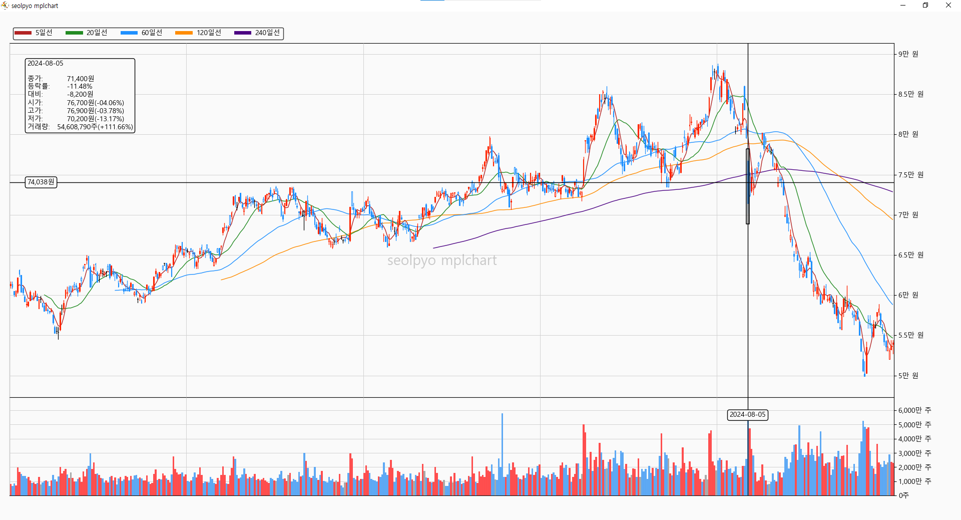
- If the mouse cursor is positioned over a candlestick or volume bar, the relevant information is displayed as text.
- The choice of GUI is not restricted to one option. It can connect with any GUI supported by matplotlib (e.g., tkinter, wxpython, pyqt, etc.).
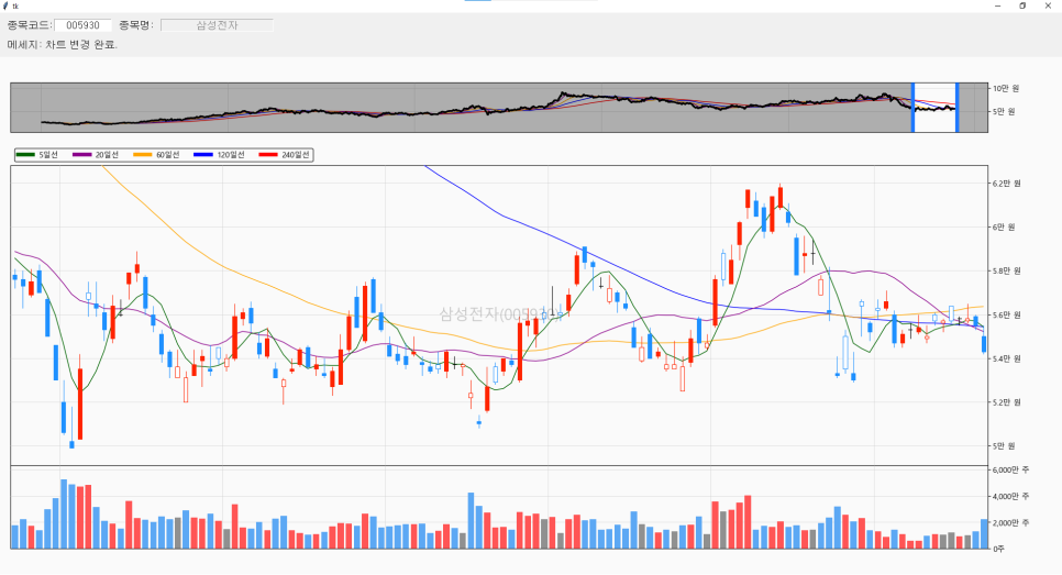
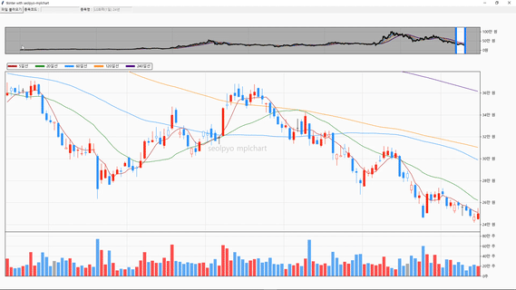
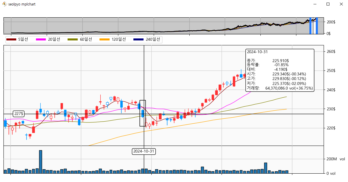
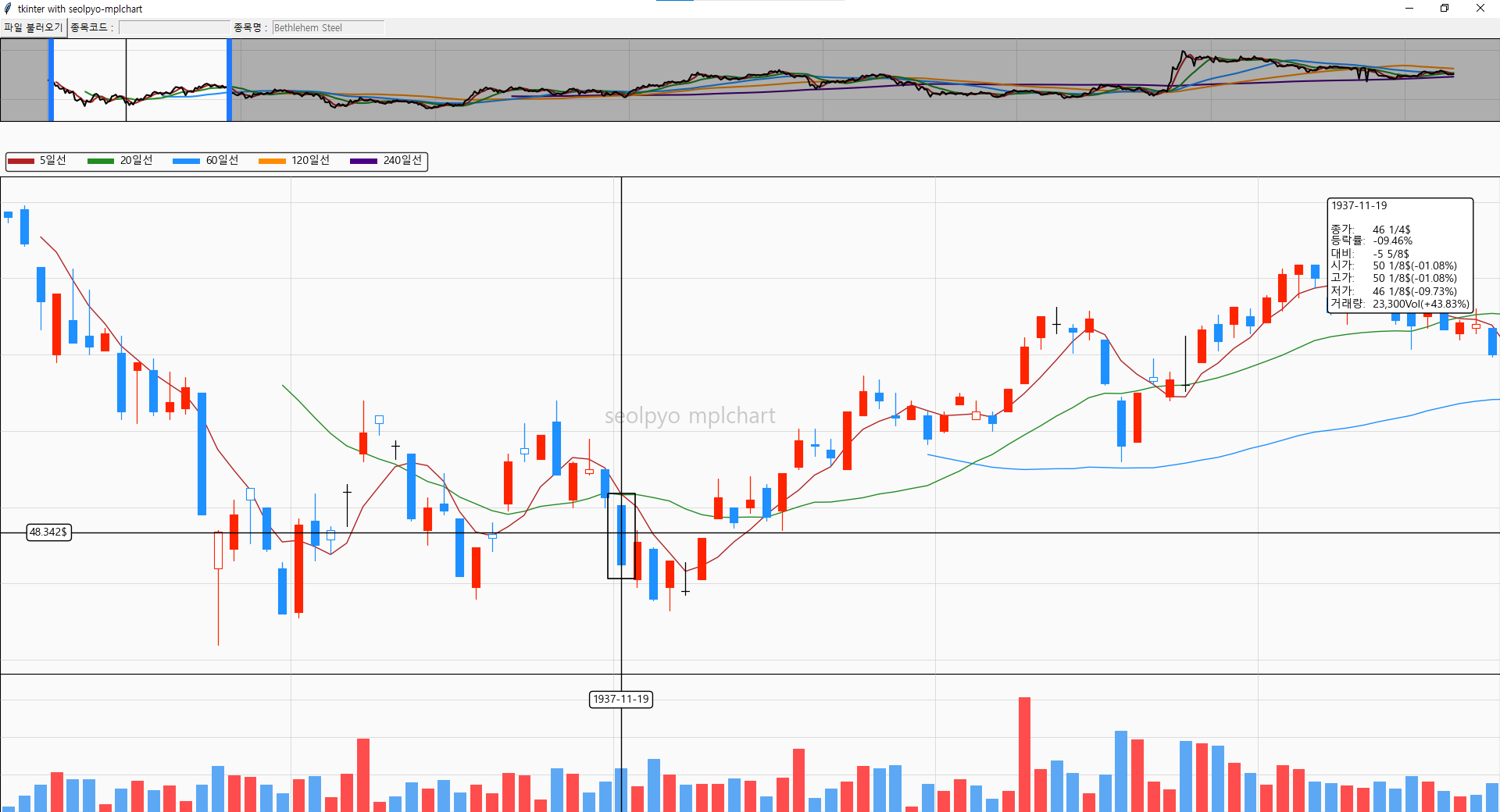
Here is a sample image of a candlestick chart created by connecting to tkinter.
Basic Usage Instructions
You can create a chart object using seolpyo_mplchart.SliderChart() and provide stock price data through the set_data() method.
The data provided must be in the form of a pandas.DataFrame.
Afterward, executing seolpyo_mplchart.show() will open the chart.
The seolpyo_mplchart.show() function calls the matplotlib.pyplot.show()
import json

import seolpyo_mplchart as mc
import pandas as pd

file = {stock price data path}
with open(file, 'r', encoding='utf-8') as txt:
    data = json.load(txt)
df = pd.DataFrame(data)

c = mc.SliderChart()
c.set_data(df)

mc.show() # same as matplotlib.pyplot.show()
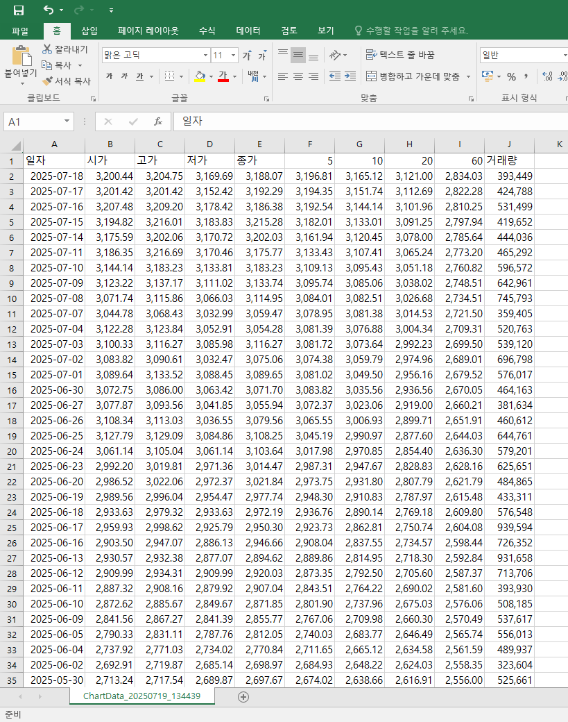
Required Data
The chart object must be provided with a DataFrame containing the following columns: [Reference Time, Open Price, High Price, Low Price, Close Price, Volume].
Data Key Modification
Each column key is [date, open, high, low, close, volume].
If the key values used in the DataFrame differ, you must modify the class variable as follows.
import json

import seolpyo_mplchart as mc
import pandas as pd

file = {stock price data path}
with open(file, 'r', encoding='utf-8') as txt:
    data = json.load(txt)
df = pd.DataFrame(data)

c = mc.SliderChart()
c.date= '시간'
c.Open = '시가'
c.high = '고가'
c.low = '저가'
c.close = '종가'
c.volume = '거래량'
c.set_data(df)

mc.show() # same as matplotlib.pyplot.show()


### OR ###


import json

import seolpyo_mplchart as mc
import pandas as pd

file = {stock price data path}
with open(file, 'r', encoding='utf-8') as txt:
    data = json.load(txt)
df = pd.DataFrame(data)

class Chart(mc.SliderChart):
  date = '시간'
  Open, high, low, close = ('시가', '고가', '저가', '종가')
  volume = '거래량'

c = Chart()'
c.set_data(df)

mc.show() # same as matplotlib.pyplot.show()
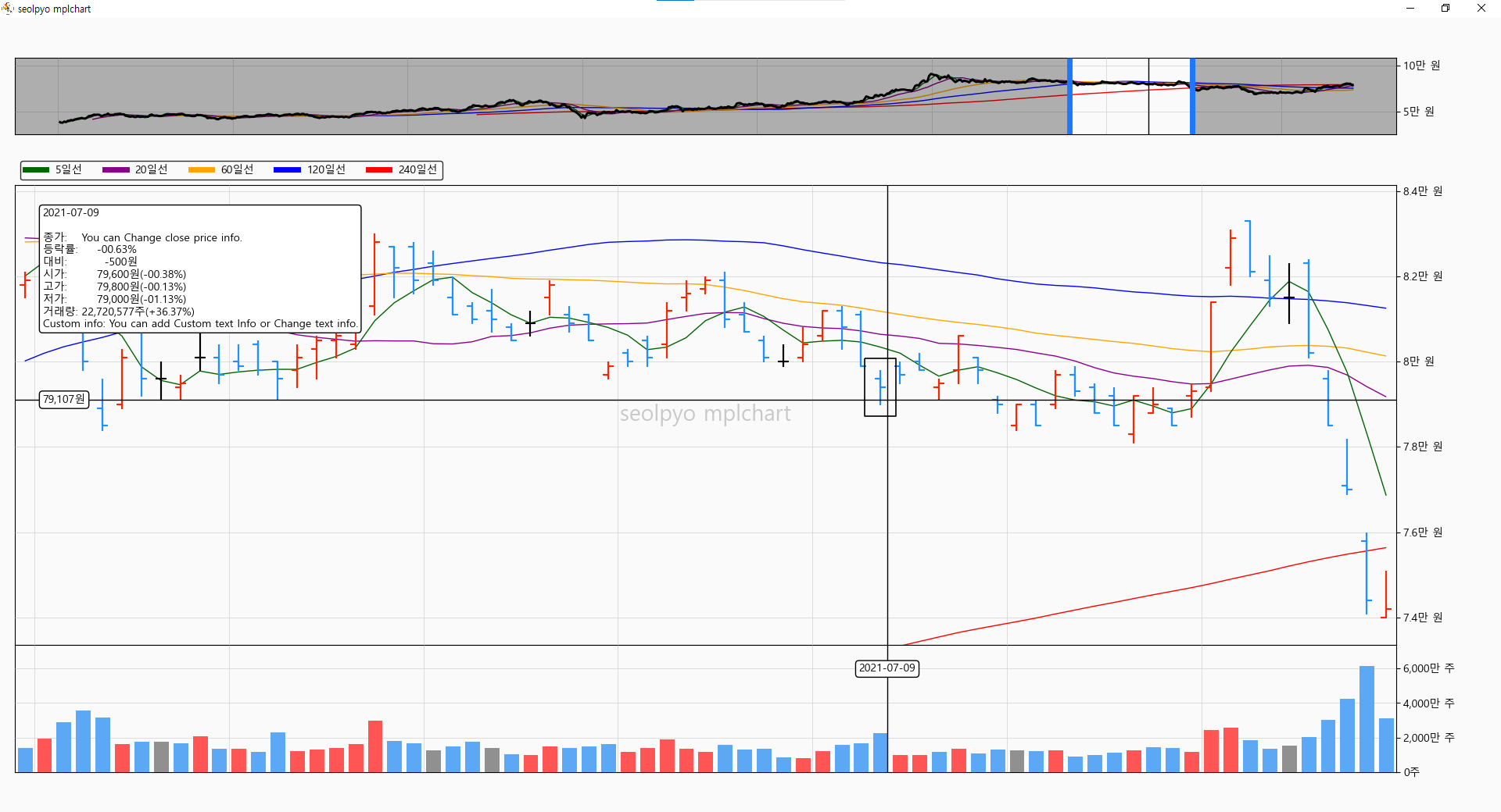
Provide 3 types of charts
seolpyo-mplchart offers a total of three types of candlestick charts.
OnlyChart
It is a standard chart similar to mplfinance.
It only draws candlestick charts and does not include interactions such as moving the range or displaying information when the mouse moves.
import json

import seolpyo_mplchart as mc
import pandas as pd

file = {stock price data path}
with open(file, 'r', encoding='utf-8') as txt:
    data = json.load(txt)
df = pd.DataFrame(data)

c = mc.OnlyChart()
c.set_data(df)

mc.show() # same as matplotlib.pyplot.show()
CursorChart
It is a chart with added mouse interaction based on the standard chart.
When the mouse is positioned over a candlestick or volume bar, information is displayed as text.
Like the standard chart, it does not include the functionality for moving the range.
import json

import seolpyo_mplchart as mc
import pandas as pd

file = {stock price data path}
with open(file, 'r', encoding='utf-8') as txt:
    data = json.load(txt)
df = pd.DataFrame(data)

c = mc.CursorChart()
c.set_data(df)

mc.show() # same as matplotlib.pyplot.show()
SliderChart

It is a cursor chart with added slider functionality.
The provided slider allows for modifying the query range.
import json

import seolpyo_mplchart as mc
import pandas as pd

file = {stock price data path}
with open(file, 'r', encoding='utf-8') as txt:
    data = json.load(txt)
df = pd.DataFrame(data)

c = mc.SliderChart()
c.set_data(df)

mc.show() # same as matplotlib.pyplot.show()
Excluding Volume Charts

If the value of "if self.volume" is false, the volume chart will not be drawn.
This option applies to all: Chart, CursorChart, and SliderChart.
import json

import seolpyo_mplchart as mc
import pandas as pd

file = {stock price data path}
with open(file, 'r', encoding='utf-8') as txt:
    data = json.load(txt)
df = pd.DataFrame(data)

c = mc.SliderChart()
c.volume = None
c.set_data(df)

mc.show() # same as matplotlib.pyplot.show()
Watermark
With the upgrade to version 1.0.0, the watermark is now displayed by default.
The reason for displaying the watermark
When querying information with candlestick charts, it felt cumbersome to identify the specific data being viewed.
To address this, a feature was added to display the relevant information at the center of the chart, making it easier to verify what data is being examined.
If you prefer not to show the watermark, simply set the value of "if watermark" to false.
To change the watermark text, modify the watermark value of the Chart object.
import json

import seolpyo_mplchart as mc
import pandas as pd

file = {stock price data path}
with open(file, 'r', encoding='utf-8') as txt:
    data = json.load(txt)
df = pd.DataFrame(data)

c = mc.SliderChart()
c.watermark = '' # watermark not display
c.watermark = 'This is watermark text' # display text
c.set_data(df)

mc.show() # same as matplotlib.pyplot.show()
How to Modify Language and Text Format
The default language is Korean.
If necessary, you can modify the price and volume units, as well as customize the format of the displayed text to your desired style.
How to Modify Display Units
The price and volume units are managed by the following two variables.
- unit_price: The unit used for price.
- unit_volume: The unit used for volume.
If necessary, you can also choose how many decimal places to display for prices and volumes.
- digit_price: The number of decimal places displayed for prices.
- digit_volume: The number of decimal places displayed for volumes.
import json

import seolpyo_mplchart as mc
import pandas as pd


class Chart(mc.SliderChart):
    unit_price = '$'
    unit_volume = 'Vol'
    digit_price = 3
    digit_volume = 1

file = {stock price data path}
with open(file, 'r', encoding='utf-8') as txt:
    data = json.load(txt)
df = pd.DataFrame(data)

c = Chart()
c.set_data(df)

mc.show()
How to Modify Information Text Format
You can modify the name of the moving average line and the text displayed in the text box.
The format includes three components: candlestick prices, trading volume, and moving average lines.
The moving average line format accepts *args, while the candlestick and volume text formats accept **kwargs.
For reference, the default English formats mc.format_candleinfo_en and mc.format_volumeinfo_en are available for use if needed.
- format_candleinfo: Text format for information displayed when the mouse hovers over a candlestick.
- format_volumeinfo: Text format for information displayed when the mouse hovers over a volume bar.
- format_ma: Text format used in the legend of moving average lines displayed on the candlestick chart.
import json

import seolpyo_mplchart as mc
import pandas as pd


class Chart(mc.SliderChart):
    unit_price = '$'
    format_ma = 'ma{}'
    format_candleinfo = '{dt}\n\nclose:   {close}\nrate:    {rate}\ncompare: {compare}\nopen:    {open}({rate_open})\nhigh:    {high}({rate_high})\nlow:     {low}({rate_low})\nvolume:  {volume}({rate_volume})'
    format_volumeinfo = '{dt}\n\nvolume:      {volume}\nvolume rate: {rate_volume}\ncompare:     {compare}'

file = {stock price data path}
with open(file, 'r', encoding='utf-8') as txt:
    data = json.load(txt)
df = pd.DataFrame(data)

c = Chart()
c.set_data(df)

mc.show()
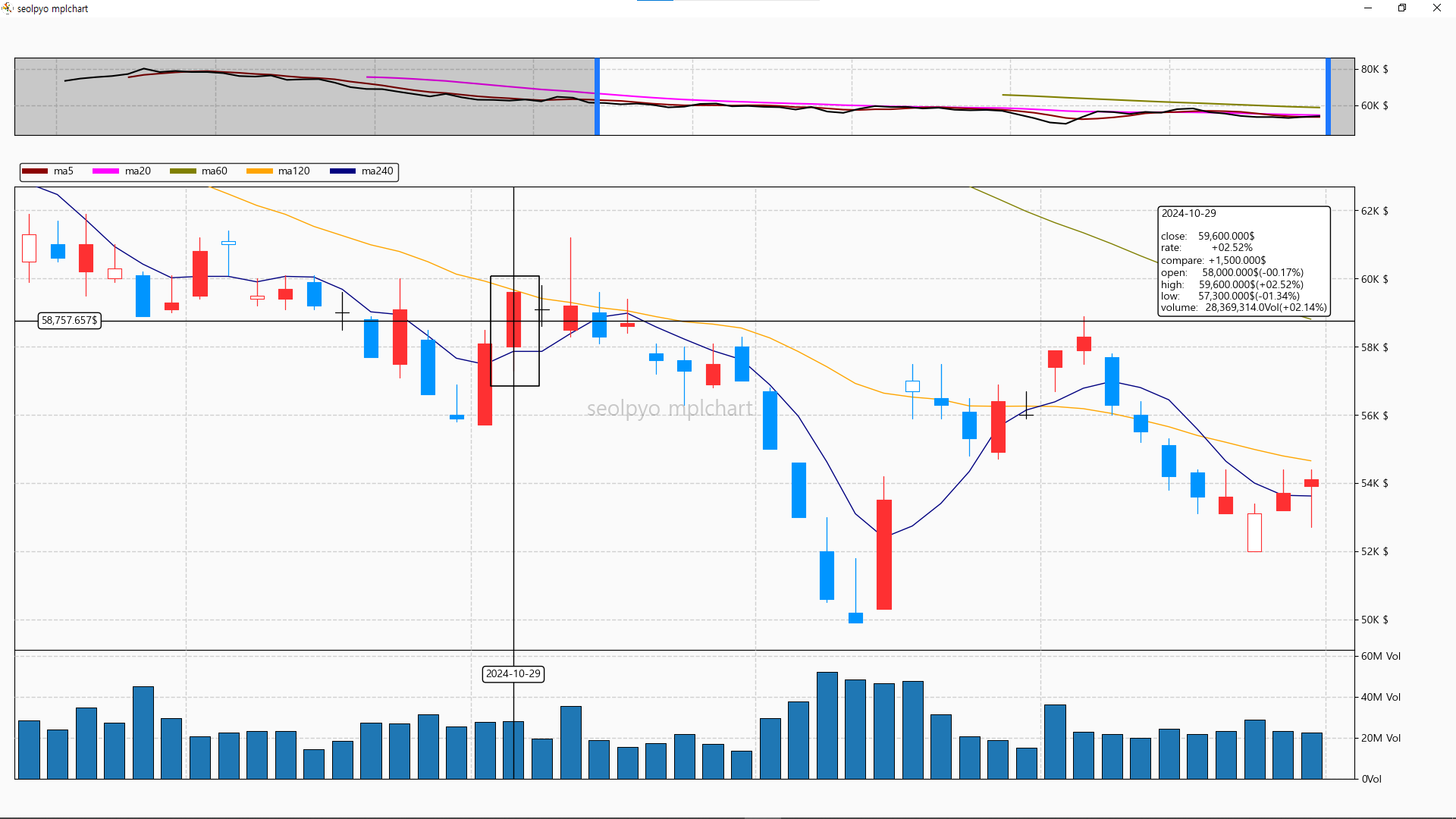
Controlling Text Information
You can modify or add data displayed in the text box through the "get_info_kwargs" method.
This functionality is available starting from version 1.4.1.
import pandas as pd
import seolpyo_mplchart as mc


class Chart(mc.SliderChart):
    format_candleinfo = mc.format_candleinfo_ko + '\nCustom info: {ci}'

    def get_info_kwargs(self, is_price, **kwargs):
        if is_price:
            kwargs['ci'] = 'You can add Custom text Info or Change text info.'
            kwargs['close'] = 'You can Change close price info.'
        return kwargs

C = Chart()
data = {stock price data}
df = pd.DataFrame(data)

C.set_data(df)

mc.show()
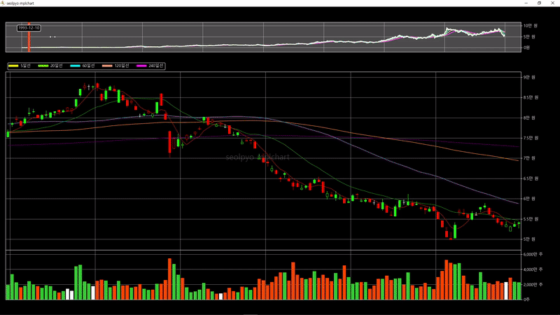
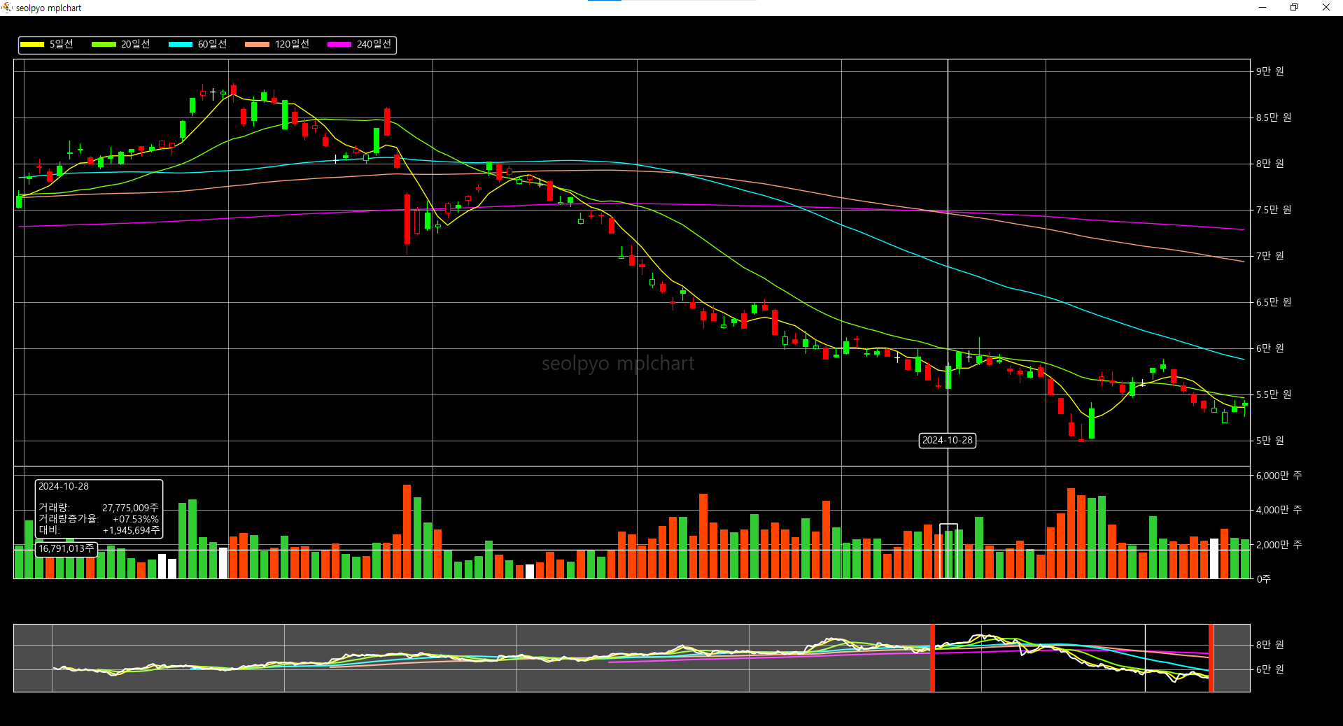
Changing Chart Style
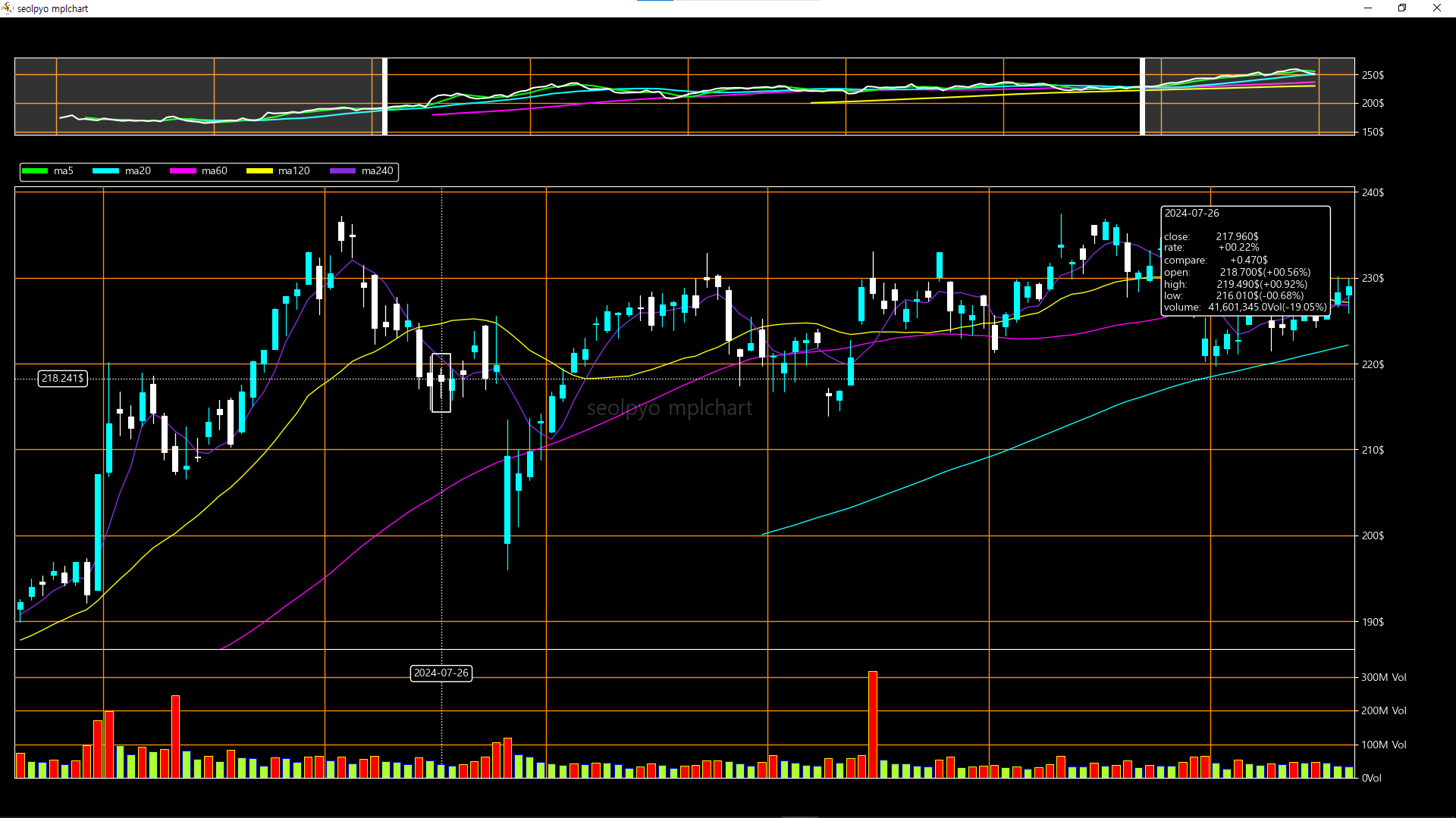
Since I prefer a white background, the default chart style is bright. If you want to change the chart style, you can adjust the respective values to create your desired chart design.
Below are the configurable settings for customization:
- color_background: Background color
- gridKwargs: Options applied to the grid drawn on the background
- color_tick: Color applied to ticks
- color_tick_label: Color applied to tick labels
- color_up: Color applied to candles where the closing price is higher than the opening price
- color_down: Color applied to candles where the closing price is lower than the opening price
- color_flat: Color applied to candles where the closing price is equal to the opening price
- color_up_down: Color applied to candles where the closing price is higher than the opening price but lower than the previous closing price
- color_down_up: Color applied to candles where the closing price is lower than the opening price but higher than the previous closing price
- color_priceline: Color applied to the closing price line chart and unspecified moving average lines
- facecolor_volume: Body color of the volume bar
- edgecolor_volume: Edge color of the volume bar
- list_macolor: Colors applied to moving average lines
- lineKwargs: Options applied to lines generated when the mouse is positioned over the chart
- color_box: Color applied to the box highlighting a candle or volume when hovered by the mouse
- textboxKwargs: Options applied to the information text box
- textKwargs: Options applied to the information text object
- color_navigator_color: Cover color applied to unselected areas
- color_navigator_line: Vertical line color displayed on the boundaries of the selected area
- generate_data(class method): A class method executed before segment generation. By overriding this method, you can change the color of the volume bar under specific conditions
import json

import seolpyo_mplchart as mc
import pandas as pd


class Chart(mc.SliderChart):
    digit_price = 3
    digit_volume = 1

    unit_price = '$'
    unit_volume = 'Vol'

    format_ma = 'ma{}'
    format_candleinfo = format_candleinfo_en
    format_volumeinfo = format_volumeinfo_en

    color_background = (0, 0, 0, 1)
    gridKwargs = dict(linestyle='-', color='darkorange')
    color_tick = 'w'
    color_tick_label = 'w'

    color_up = 'aqua'
    color_down = 'w'
    color_flat = 'w'
    color_down_up = 'w'
    color_up_down = 'aqua'
    color_priceline = 'w'
    facecolor_volume = 'greenyellow'
    edgecolor_volume = 'blue'
    list_macolor = ['lime', 'cyan', 'fuchsia', 'yellow', 'blueviolet']
    lineKwargs = dict(edgecolor='w', linestyle=':')
    color_box = 'w'
    textboxKwargs = dict(edgecolor='w', facecolor='k')
    textKwargs = dict(color='w')
    color_navigator_cover = 'w'
    color_navigator_line = 'w'

    def generate_data(self):
        self.df.loc[self.df[self.volume].shift(1) < self.df[self.volume], ['volumefacecolor', 'volumeedgecolor']] = ('red', 'yellow')
        return


file = {stock price data path}
with open(file, 'r', encoding='utf-8') as txt:
    data = json.load(txt)
df = pd.DataFrame(data)

c = Chart()
c.set_data(df)

mc.show()
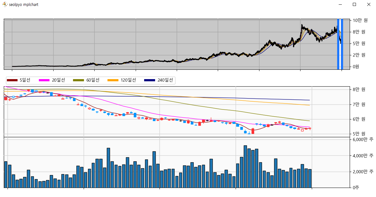
How to Change Chart Theme

You can change the theme of a chart object using the built-in set_theme function.
There are two theme options available: light and dark.
import json

import seolpyo_mplchart as mc
import pandas as pd


class Chart(mc.SliderChart):
    digit_price = 3
    digit_volume = 1

    unit_price = '$'
    unit_volume = 'Vol'

    format_ma = 'ma{}'
    format_candleinfo = format_candleinfo_en
    format_volumeinfo = format_volumeinfo_en


file = {stock price data path}
with open(file, 'r', encoding='utf-8') as txt:
    data = json.load(txt)
df = pd.DataFrame(data)

c = Chart()
mc.set_theme(c, 'dark')
c.set_data(df)

mc.show()
How to Display Fractions
If "fraction" is true, numbers below the decimal point are displayed as fractions. The displayed fractions are influenced by the values of "digit_price" and "digit_volume".
import json

import seolpyo_mplchart as mc
import pandas as pd


class Chart(mc.SliderChart):
    unit_price = '$'
    unit_volume = 'Vol'
    digit_price = 3
    digit_volume = 1
    fraction = True

file = {stock price data path}
with open(file, 'r', encoding='utf-8') as txt:
    data = json.load(txt)
df = pd.DataFrame(data)

c = Chart()
c.set_data(df)

mc.show()
Options for the set_data Method
The "set_data" method accepts the following arguments in addition to the DataFrame:
- sort_df: If True, the DataFrame is sorted in ascending order based on the reference time column.
- calc_ma: If True, data for generating moving average lines is calculated. If False, pre-calculated moving average line data must already exist in the DataFrame. Each column key should follow the "ma{n}" format and must match list_ma one-to-one.
- change_lim: If True, the initial query range is modified. If False, the query range remains unchanged.
- calc_info: If True, data for the text box is calculated. If False, pre-calculated information must already exist in the DataFrame. The column keys should be: 'rate', 'compare', 'rate_open', 'rate_high', 'rate_low', 'rate_volume'.
- set_candlecolor: If False, candle colors are not arbitrarily set. If the provided DataFrame lacks the "facecolor" and "edgecolor" columns, an error is raised.
-
set_volumecolor: If False, volume bar colors are not arbitrarily set. If the provided DataFrame lacks the "volumefacecolor" and "volumeedgecolor" columns, an error is raised.
If any of the described tasks are unnecessary, you can set each argument to False to skip those processes.
import json

import seolpyo_mplchart as mc
import pandas as pd


file = {stock price data path}
with open(file, 'r', encoding='utf-8') as txt:
    data = json.load(txt)
df = pd.DataFrame(data)

c = mc.SliderChart()
c.set_data(df, sort_df=True, calc_ma=True, change_lim=True, calc_info=True, set_candlecolor=True, set_volumecolor=True)

mc.show()
Changing the Shape of Candles and Volume Bars

You can modify the shape of the drawn candles using the "get_candle_segment" method.
For volume bars, you can change their shape through the "get_volume_segment" method.
Similarly, you can adjust the color application methods for candles and volume bars using the "add_candle_color_column" and "add_volume_color_column" methods.
These methods have been added starting from version 1.4.1.
import pandas as pd
import seolpyo_mplchart as mc

class Chart(mc.SliderChart):
    def __init__(self, *args, **kwargs):
        super().__init__(*args, **kwargs)
        self.collection_candle.set_linewidth(1.5)
        return

    def get_candle_segment(self, *, x, left, right, top, bottom, is_up, high, low):
        if is_up:
            return (
                (x, high),
                (x, top), (right, top), (x, top),
                (x, bottom), (left, bottom),
                (x, bottom), (x, low), (x, high)
            )
        else:
            return (
                (x, high),
                (x, bottom), (right, bottom), (x, bottom),
                (x, top), (left, top), (x, top),
                (x, low), (x, high)
            )


C = Chart()

data = {stock price data}
df = pd.DataFrame(data)

C.set_data(df)

mc.show()
Simplified Display Based on Query Range
In seolpyo-mplchart, if the dataset is large, only a portion is drawn rather than the entire dataset.
The reasons are as follows:
- To prevent a decline in screen transition speed, as drawing more data slows the transition.
- Excessive drawing may result in indistinguishable details, thus reducing unnecessary processes.
Depending on your computer's specifications, screen transitions like sliding or moving the chart may experience lag.
In such cases, you should simplify the objects drawn on the chart by lowering the values of the following variables.
Conversely, if your computer's specifications are good enough to handle additional drawing without speed loss, you can set these values higher than the defaults:
- limit_candle: The maximum number of candles drawn on the screen. Beyond this limit, only the wick is drawn. Default value: 800.
- limit_wick: The maximum number of wicks drawn on the screen. Beyond this limit, a closing price line chart is drawn instead. Default value: 4,000.
- limit_volume: When wicks or closing price line charts are drawn, the maximum number of volume bars displayed on the screen. Default value: 200.
※ limit_volume is only applied in SliderChart. - limit_ma: If the number of data points displayed in the closing price line chart exceeds this value, the moving average lines are not drawn. Default value: 8,000.
※ limit_ma is only applied in SliderChart.
Transitioning from Candles to Wicks

Transitioning from Wicks to Closing Price Line Chart

import json

import seolpyo_mplchart as mc
import pandas as pd


class Chart(mc.SliderChart):
    limit_candle = 800
    limit_volume = 800
    limit_wick = 4000
    limit_ma = 8000

file = {stock price data path}
with open(file, 'r', encoding='utf-8') as txt:
    data = json.load(txt)
df = pd.DataFrame(data)

c = Chart()
c.set_data(df)

mc.show()
Minimum Query Range
If the number of candles displayed within the selectable area of the navigator is smaller than "min_distance", the query range will not change.
To modify the minimum query range, you need to adjust the value of "min_distance". The default value is 30.
import json

import seolpyo_mplchart as mc
import pandas as pd


class Chart(mc.SliderChart):
    min_distance = 30

file = {stock price data path}
with open(file, 'r', encoding='utf-8') as txt:
    data = json.load(txt)
df = pd.DataFrame(data)

c = Chart()
c.set_data(df)

mc.show()
How to Change Slider Position
If the value of "slider_top" is not True, the slider will be positioned at the bottom of the chart. The default value is True.
import json

import seolpyo_mplchart as mc
import pandas as pd


class Chart(mc.SliderChart):
    slider_top = False

file = {stock price data path}
with open(file, 'r', encoding='utf-8') as txt:
    data = json.load(txt)
df = pd.DataFrame(data)

c = Chart()
c.set_data(df)

mc.show()
Changing Chart Proportions
You can adjust the proportions of each chart area using the values of "ratio_ax_slider", "ratio_ax_legend", "ratio_ax_price", "ratio_ax_volume", and "ratio_ax_none".
The value "ratio_ax_none" is only used when the value of "slider_top" is False.
import json

import seolpyo_mplchart as mc
import pandas as pd


class Chart(mc.SliderChart):
    ratio_ax_slider, ratio_ax_legend, ratio_ax_price, ratio_ax_volume = (3, 1, 3, 3)
    ax_none = 2

file = {stock price data path}
with open(file, 'r', encoding='utf-8') as txt:
    data = json.load(txt)
df = pd.DataFrame(data)

c = Chart()
c.set_data(df)

mc.show()
Drawing Moving Average Lines Over Candlesticks

If the value of "candle_on_ma" is False, moving average lines are drawn over the candlesticks.
import json

import seolpyo_mplchart as mc
import pandas as pd


class Chart(mc.SliderChart):
    candle_on_ma = False

file = {stock price data path}
with open(file, 'r', encoding='utf-8') as txt:
    data = json.load(txt)
df = pd.DataFrame(data)

c = Chart()
c.set_data(df)

mc.show()
Event Control Methods
seolpyo-mplchart accepts the following events: pick event, draw event, and mouse click/release/move event. When each event occurs, the corresponding method is called.
To perform tasks upon the occurrence of these events, you can override the respective methods for control. Overriding each method does not affect the module's event handling process.
Additionally, you can use the draw_artist method to add artist-related tasks that need to be drawn before the blit process.
import json

import seolpyo_mplchart as mc
import pandas as pd


class Chart(mc.SliderChart):
    def on_draw(self, e):
        return

    def on_pick(self, e):
        return

    def draw_artist(self):
        return

    def on_move(self, e):
        return

    def on_click(self, e):
        return

    def on_release(self, e):
        return


file = {stock price data path}
with open(file, 'r', encoding='utf-8') as txt:
    data = json.load(txt)
df = pd.DataFrame(data)

c = Chart()
c.set_data(df)

mc.show()